Interpreting Astronomy Visualizations for Beginners
• James Hedberg
Introduction
If we were only allowed to use photographs taken by cameras to explain science and share the beauties of the nature world, as some would have us do, our options would be sorely limited. As an example, consider the famous Pale Blue Dot image. This photograph shows the Earth (appearing as a small white dot near the center of the frame) and was taken at a distance of about 6 billion kilometers away from the Earth. It is our farthest away image of the solar system.
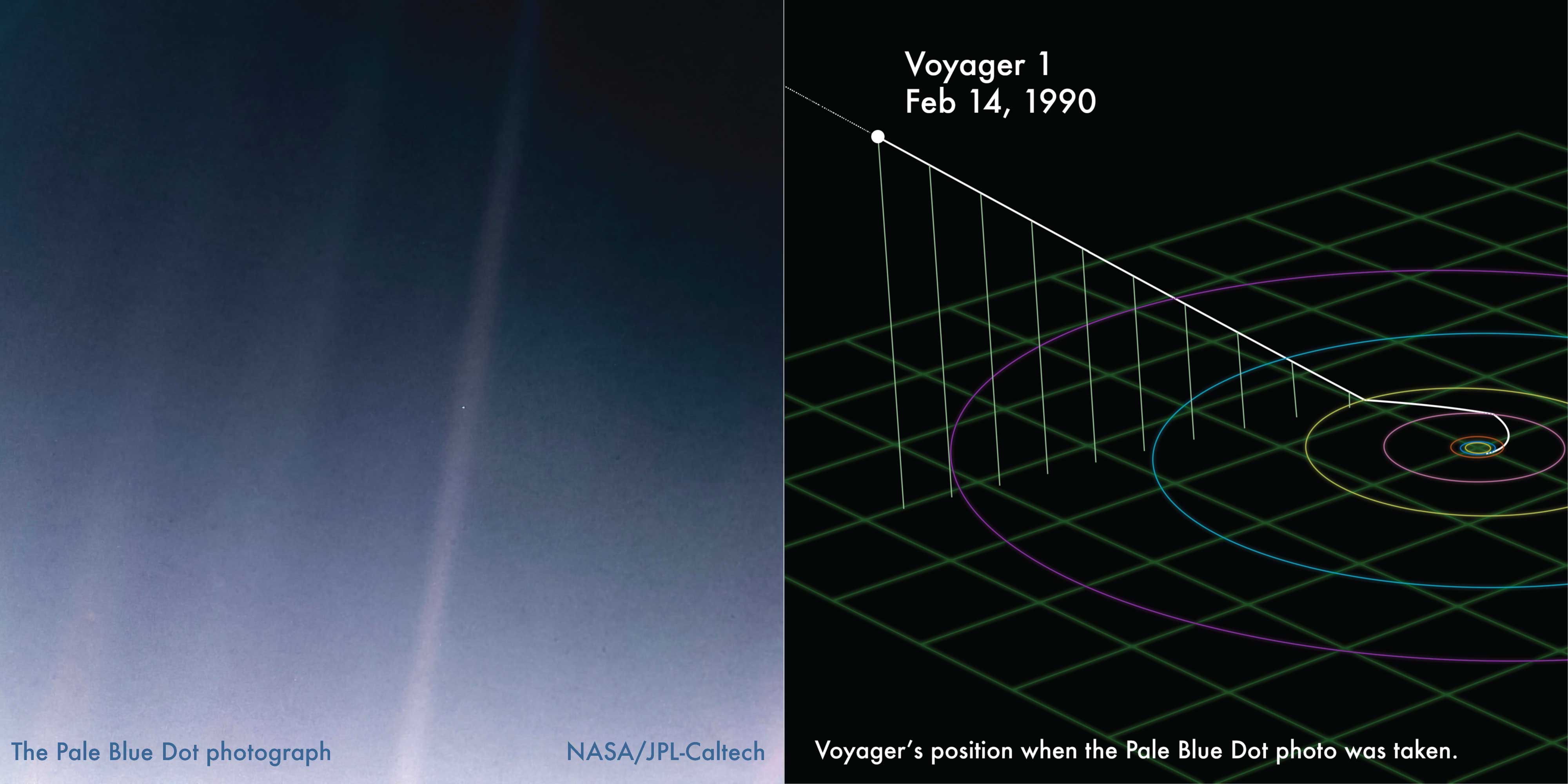
And while the image does offer vast room for interpretations and cosmic significance related thoughts, its explanatory value is somewhat limited. All we see is a tiny little white speck that is the Earth (and yes, that’s the crux of the philosophical interest here, but not the focus of this story). Would you use this to teach about the layout of the solar system? Probably not. Can it help plan trajectories to Mars? Not really. But this is all we’ve got in terms of ‘photos of the solar system’. So we have to do something else.
On the right in the above image is another visualization. This one shows the position of the Voyager at the moment the Pale Blue Dot was captured. While this view is less romantic and perhaps appeals less to the poetic side of space, it does offer much more information about the event. We see where Voyager was, how it got there, where it’s going, etc. We can see that it was ejected from the plane of the solar system after its visit to Saturn. It shows how small the Earth’s orbit is compared to the outer planets’.
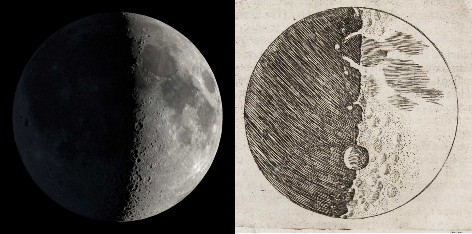
Ever since Galileo drew the moon in his notebook while looking through the telescope, scientists have had to deal with the issue of finding the best representation of the observed data to explain the science. In Galileo’s case, his drawings were not picture perfect representations of what the moon actually looks like. We know what the moon should have looked like on Dec 18, 1609, and it does resemble Galileo’s drawing, but it not identical to them.[footnote] But his goal was not to draw a perfect picture of the moon but to make the case that the moon had mountains! and craters! and was not a perfectly smooth sphere, which the cosmologies of his era demanded (without evidence of course). Not to mention, he was basing his drawings on what he saw through the eyepiece of one the earliest telescopes ever made, so perhaps it didn’t offer the same fidelity we’d expect from a modern instrument.
Fast forward to the present day. We no longer have to draw the things we see in eyepiece, or plot graphs by hand. Much of the grunt work is done by computers when preparing scientific visuals. They are great at translating data into pictures. But, the human still has to be there to help guide the process and make choices that may influence the interpretation of the image. For what follows we’ll use a software package called OpenSpace [footnote] that converts data about our known universe into visual displays using well established tools of 3d graphics and other computer visualization techniques (i.e. kind of like video games do)
Painting a digital globe with Data
Think out Galileo’s moon, we can explore how we might ‘build’ a view of the Earth to show some data set concerning terrestrial information.
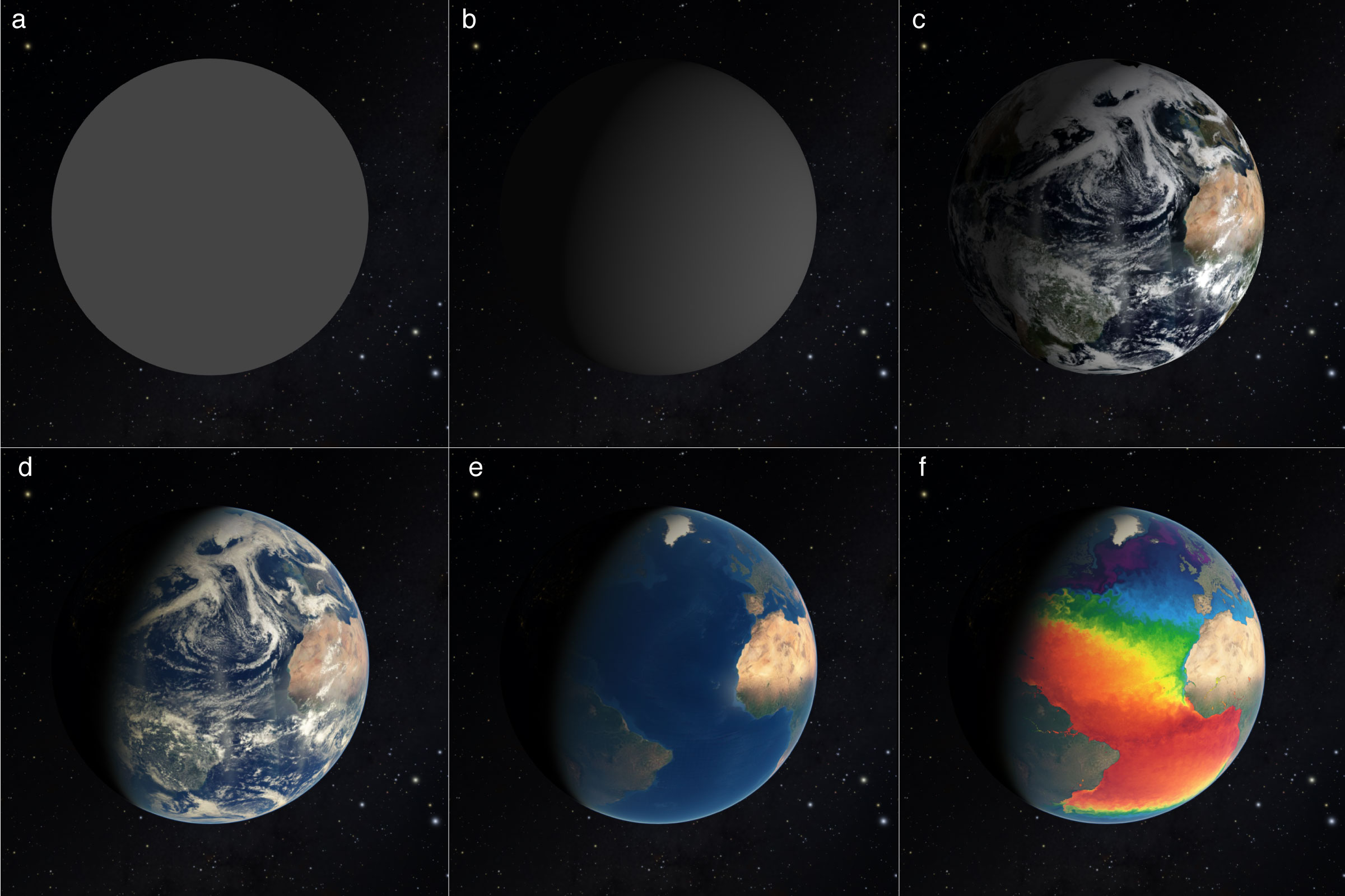
In the above image, you can see the progression from a rendering of an unshaded sphere all they through to a globe with land masses and sea surface temperature. We can apply daily satellite images to our globe (panel c), add an atmosphere to enhance the realism (panel d), subtract away the clouds so we can just see the land underneath (panel e) and finally add a layer that contains temperature information about the sea surface (panel f)[ref]
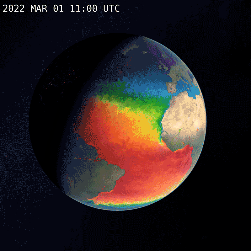
Finally, maybe we want to explore how this data changes in time. Below is an animated sequence of 31 snapshots showing how the Sea Surface temperature changed during March 2022. The data shown is obtained from satellites orbiting the Earth.
This process of applying images and geospatial data to 3d objects is a very well established visualization technique - essentially the modern day version of hand made globe making. Google Earth uses similar technology as do many video games and movies. The difference between our work and the latter is that we are using data to paint our globes, not just imaginations. (see more in this article: Introduction to Scientific Visualization )
Voyager and Space Visuals
Let’s go back to Voyager 1. Pretend we’ve hitched a ride on the little spaceship and we peek over its should on Feb 14th, 1990. Here’s the view:
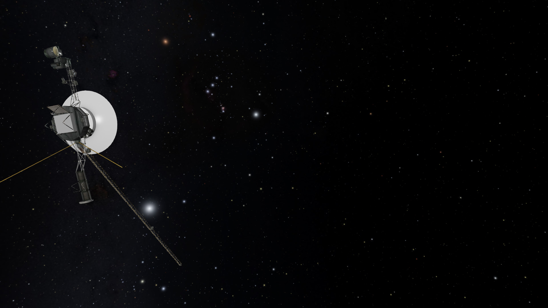
It’s pretty. There’s the constellation Orion in the upper middle section. The tiny fuzzy ball to the right of the center is the sun. Somewhere around there is Earth and the other planets. But, even this doesn’t explain much. So let’s start adding some helpful guides. Here, in the next image, we’ve put colored lines along the trails the planets make as they go around the sun.
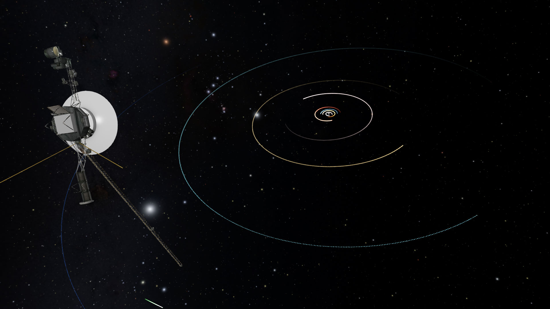
The addition of the orbit trails to the image will seem a trivial thing to most astronomers and scientists. However, it does represent a powerful and fundamental step. We have abstracted the motion of the planets that normally occurs in time, into a static non-changing visual representation. It’s much like a path worn in the grass. We know the path’s points so we can add a little colored pixel to the image on every point. These trails can’t be seen in space of course, but if we took pictures every day from Voyager’s position, then added all the pictures together, you would see the little dot of the Earth make an ellipse around the sun. That’s it’s orbit.
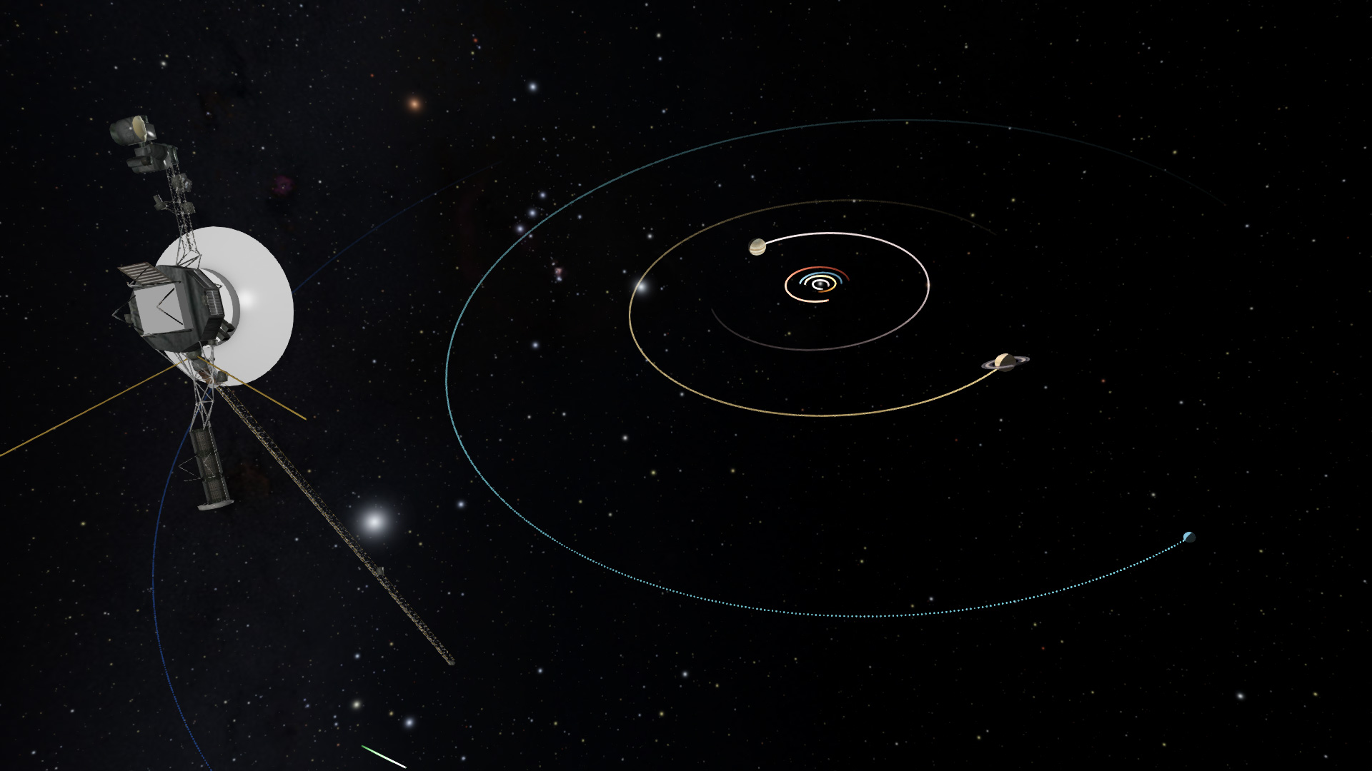
The next thing people usually do when rendering the solar system is to change the scale of the planet sizes. This is often a helpful transformation since the planets are very small compared to the distances between them. In the scales of the images above, the planets’ diameters would be smaller than a pixel, so basically invisible.
Here’s an image, from the same location as the above, but the planet’s diameters are increased by a factor of 1000. At this scale we can see Jupiter and Saturn and Uranus, but the inner planets are still too small to even make out.
The above treatment of the Voyager trajectory shows just a few of the simplest modifications we can make that increase the information content of a visualization, while staying true to the data. That’s the delicate balance every science visualization must content with. Do you just want to show what the human eye would see? Or do you want to show what we understand about the natural world. Those can be different things.
Conclusion
Our work in the Planetarium is largely driven by the mission to present science accurately to our guests. If they want Hollywood movie magic, there are other venues for that. That doesn’t mean we just show plots and graphs though. We strive to find the happy middle ground between serious science content and engaging visualizations.
References:
[1] Dial-A-Moon: https://svs.gsfc.nasa.gov/4874
[2] Sea Surface Tempearture, GHRSST Level 4 MUR Global Foundation Sea Surface Temperature Analysis (v4.1) https://podaac.jpl.nasa.gov/dataset/MUR-JPL-L4-GLOB-v4.1
[3] OpenSpace Project : open source interactive data visualization software designed to visualize the entire known universe and portray our ongoing efforts to investigate the cosmos.