What is Science Visualization
• James Hedberg
A brief overview (for non-specialists) of what we do as science visualizers (SciVis for short) in the planetarium.
Introduction
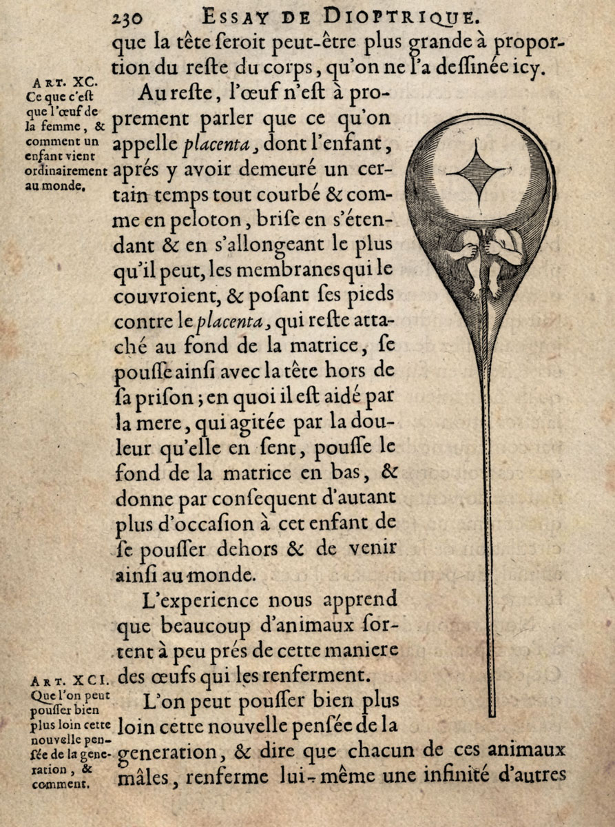
The tools of science are manifold. Explorers of the natural world have employed math, language, music, logic, and art to build theories, predict the future, and explain the workings of our universe. Over time, how these tools are used, and their complexity has naturally evolved, in step with the complexity of the science or phenomena under investigation. Figure 1 shows an early sketch of what one early microscopist thought he saw inside a sperm cell: a little human. Nicolaas Hartsoeker really though he saw such a shape when looking through the rudimentary microscope he had access too. He included the sketch in his Essay de Dioptrique in 1694. While we obviously have better microscopes now, and know that this interpretation of the observed data is wrong, we can still appreciate his effort to try to explain the form and function of the biology of human reproduction by employing a graphical representation of the data. It's certainly a lot more useful than just saying angels did it.
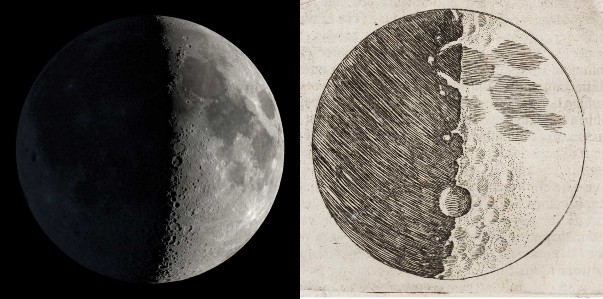
This is by no means the first example of science visualization in the historic literature. Nearly 100 years earlier, Galileo shared the view of the moon as he saw it in his telescope. The basic understanding of the surface of the moon in his time was that it should be smooth. Yes, it was an orb, but the surface would not have mountains or valleys or other imperfections, since it belongs to the celestial world. His drawings were done to show evidence that there were indeed topographical variations in the lunar surface, as evidenced by the shadows. Figure 2 shows two images: A modern rendering of the moon as it would have looked around the time he sketched his drawing, and Galileo's artwork from the Siderius Nuncius (1610). We can see immediately that his drawing is not a perfectly faithful reproduction of the moon's surface. The craters are not exactly in the right places and their sizes are different. Perhaps he wasn't a well trained artist? Perhaps he knowingly exaggerated the effects to make his point? It's hard to know his mind but regardless, he tried to visualize a phenomenon in nature: the appearance of shadow on the moon due to surface features. And, he was successful in this effort. Subsequent observations by others confirmed the bumpy lunar surface.
Visualization in a Planetarium
While the history of science visualization is worth a much longer post, we’ll fast forward to the present day and discuss how we produce our visualizations and what our goals are. A planetarium is a room with a projection system that can illuminate a hemispherical dome above the audience. In its simplest form, using the original opto-mechanical projection systems (a ball with a light bulb in it and lots of little holes), we can reproduce a night sky full of stars and perhaps show a few planets as well. As technologies advanced, we now use digital projectors to display computer graphics in an immersive environment. Our goals are to try to display the natural world faithfully. However, if we just showed the night sky as it appeared to an earth bound observer looking up, we would be missing out on an enormous opportunity. Modern science visualization can use the same technologies that create the imaginary worlds of movies to reproduce our true universe. However, there is a key difference, and we need to say it loudly:
We use experimentally obtained measurements of the natural world to construct the visualizations.
Let’s explain. Below are two scenes. One from Star Wars, and one that we might make as part of a visualization product. The Star Wars scene has a planet (well a moon of a planet technically), a space station (that’s no moon), and stars in the background. While some aspects are informed by science (eg the atmospheric coloring, the clouds, the shading etc), the scene is entirely fictional. The other image shows a moon of Mars, Mars itself, and the stars in background.
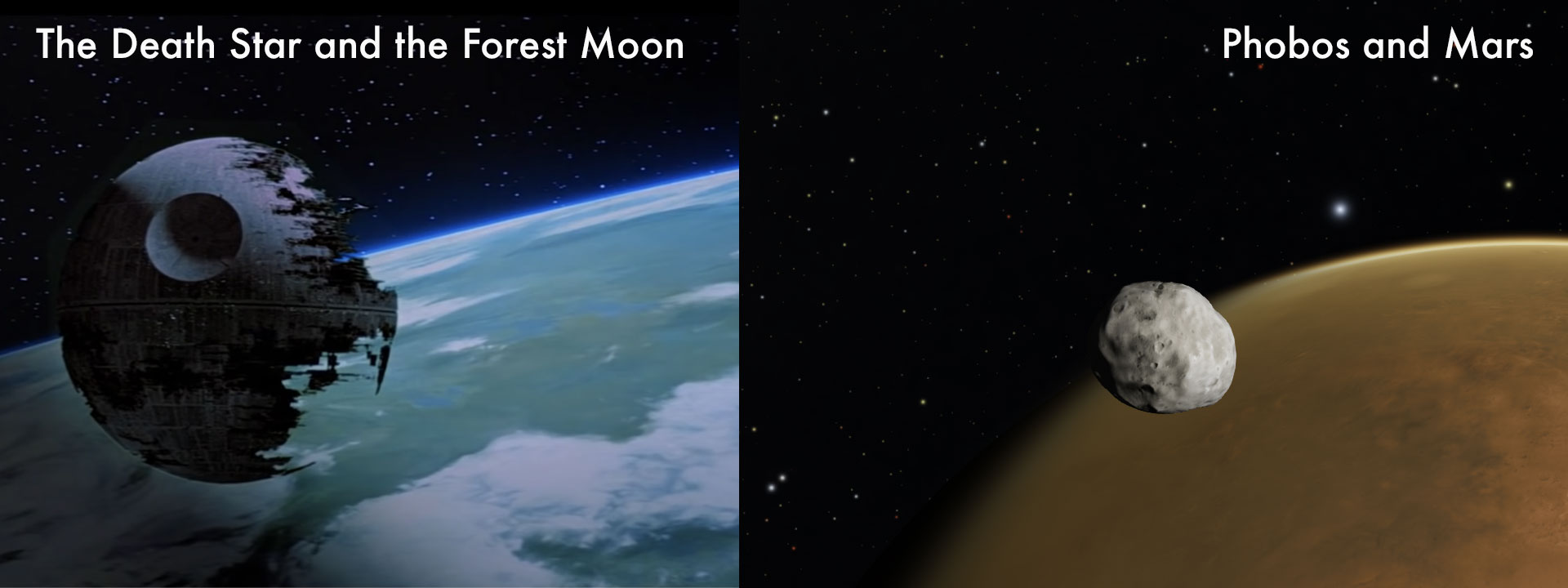
Both look rather real. However, the left image is the product of great imaginations, while the right image is based on measured data. The surface of the moon Phobos was imaged by the Mars Global Surveyor satellite. Its shape was derived from these images. The surface of Mars was likewise photographed by orbiting satellites. The images have been applied to a globe shape with a physically accurate atmosphere added. The stars in the background are positioned in the correct places based on years of observations. Even the size, position and rotation of the moon is based on observations and calculations. The shading of Phobos and Mars is done by simple geometry of light rays and how they behave. In short, it’s a physically accurate model. It’s not a photograph. Putting a camera in this exact position would be nearly impossible. So, we do the next best thing: simulate it. Yes, it’s CGI (Computer Generated Image). But, we don’t make stuff up. It’s as close to being there, floating in space looking at these objects as you can get.
Science Communication and Visualization
Now, when it comes to communicating science and the work astronomers and other researchers do, we have to be careful. Our prime objective is represent the science faithfully. This means we can't just make stuff up. Everything we present has to be rooted in research, observations, and repeatable experimental evidence. At the same however, we can take advantage of our abilities to manipulate 'sliders' that are not quite accessible in nature. For example, we can take the Mars/Phobos scene and animate it over time. Thanks to detailed calculations done by the teams at NASA/JPL, we have data sets that tell us exactly where Phobos will be at a particular time. These data sets are the same ones used to plan and navigate interplanetary space missions, so they better to be accurate! Figure 5 shows a few hours of Phobos' orbit around Mars, condensed to just a few seconds.
There are loads of technical details that are important to understanding all this. However, for the current scope of this article, we can be content with just the notion that we are using data to build the visualizations. But, that of course raises the issue: Why should you believe us? Given the Star Wars example above, we could easily make real-ish looking images of purely made up information. This is not easily resolved.
Trust in Science
If you’re reading this, you may have came from one of our social media pages. There, you probably saw some interesting visualization that sparked your interest. Maybe you read the comments underneath? They usually contain a bunch of good questions and ideas, as well as a lot of less useful notes. For example, usually there are single word comments like “Fake” or “CGI”. Yes, our simulations are CGI. We’ve always sort of assumed that was obvious. They usually have perfect weather (i.e. no clouds!), include arrows or other graphical elements, or even capture time scales impossible for humans (i.e. the future!). So yes, they are CGI. Are they fake? No. That doesn’t seem like the right word here.
Any image you see on a phone is technically CGI. Photons collided with a CCD detector and pushed an electron around. This signal then is converted to brightness, color, and pixel position information, by carefully constructed software and code. Thus, even while looking at a photograph, you really are looking at CGI. Unless you used real film, and developed the negatives yourself, it’s all CGI these days. Get used to it. What makes our CGI different is the input data used to create the arrays of RGB you see on the screen. And this is what you have to have faith in. Have faith in us. We are PhD trained scientists and the software we use was likewise built by experts. Sure, there are occasionally errors. But once they are spotted, they are corrected.
In short, we are experts. We are part of a major academic institution and not just out to sell t-shirts, like many social media pages. If you’re looking at the videos on an account called something like “space._.fans” or “astr0wund3rs” then be wary of what you see. If the site says “DM for paid promotion” then you can be nearly certain that they don’t vet any of the content they post. They are trying to gain followers to sell crap or make advertising revenue. That’s it. This is our job to make science visuals, not sell mugs.
References:
[1] Dial-A-Moon: https://svs.gsfc.nasa.gov/4874
[2] OpenSpace: Open source interactive data visualization software designed to visualize the entire known universe and portray our ongoing efforts to investigate the cosmos. OpenSpace Project →